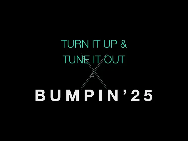
BUMPIN'25
A visual system for Bumpin'25, a festival celebrating 2010s nostalgia and the era's resilient spirit, where music became an escape from economic uncertainty and a source of collective hope. Worked alongside two other talented graphic designers.


How might we use music as a means of coping with the effects of the great recession.
Initial Concepts
Draft 1
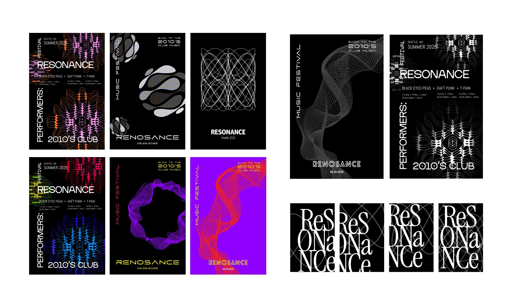
Draft 2

Draft 3
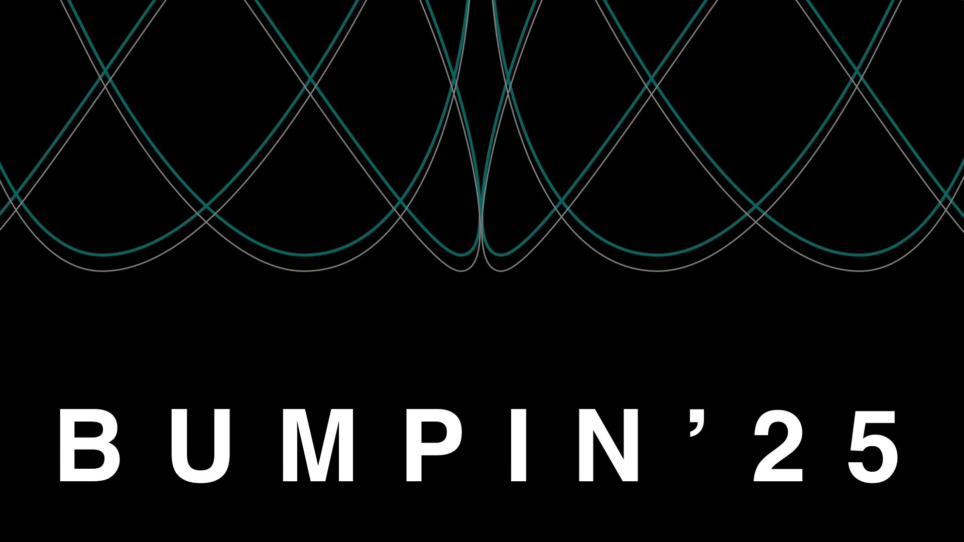
Visual System
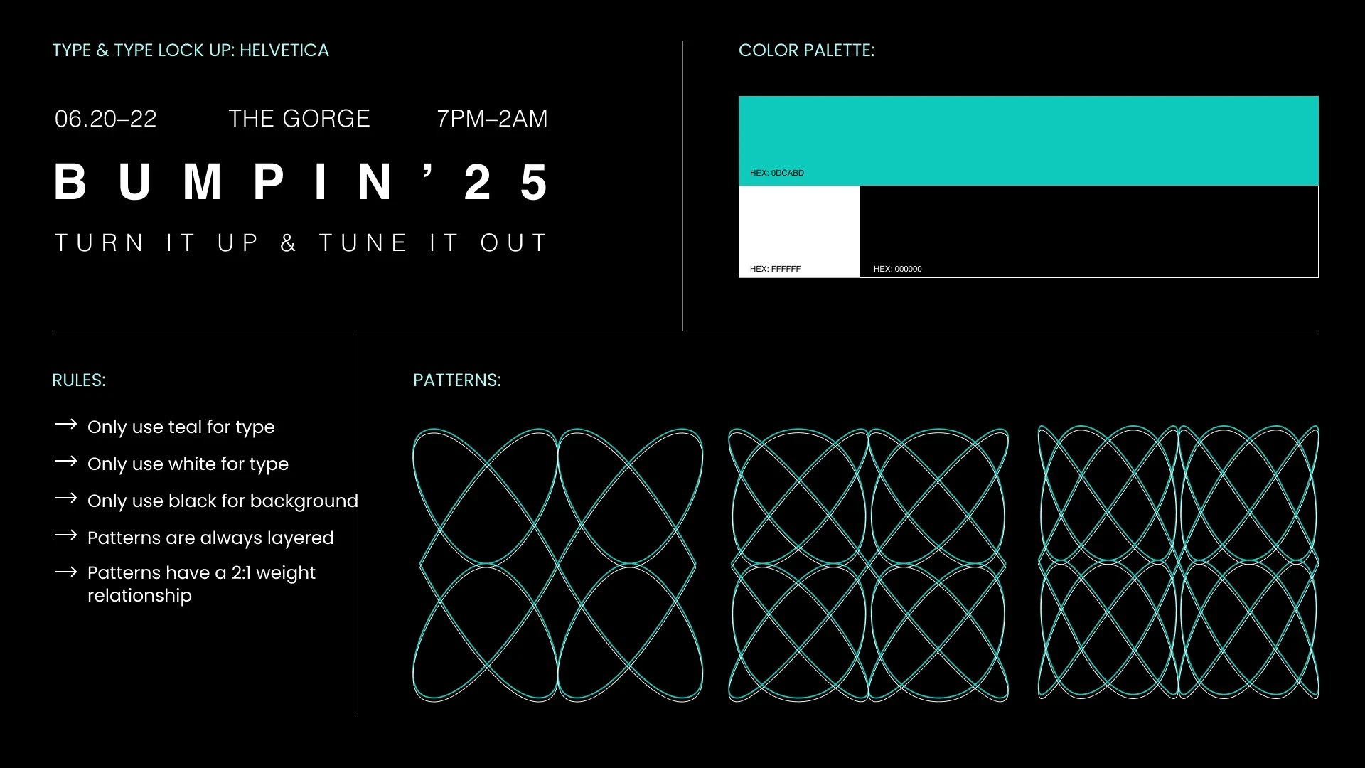
The thin-lined shapes were inspired by exploring the emotional and physical qualities of music through visualization, beautiful patterns created from the vibrations of sound waves. Our goal was to create a music festival experience that goes beyond just listening: music you can hear, see, and feel. We developed a design system with consistent patterns applied across all festival applications and poster designs, ensuring visual cohesion throughout the brand experience.
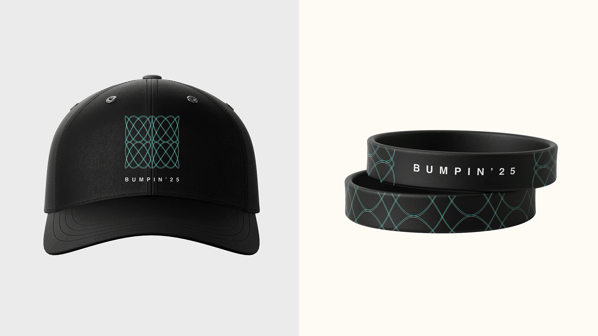
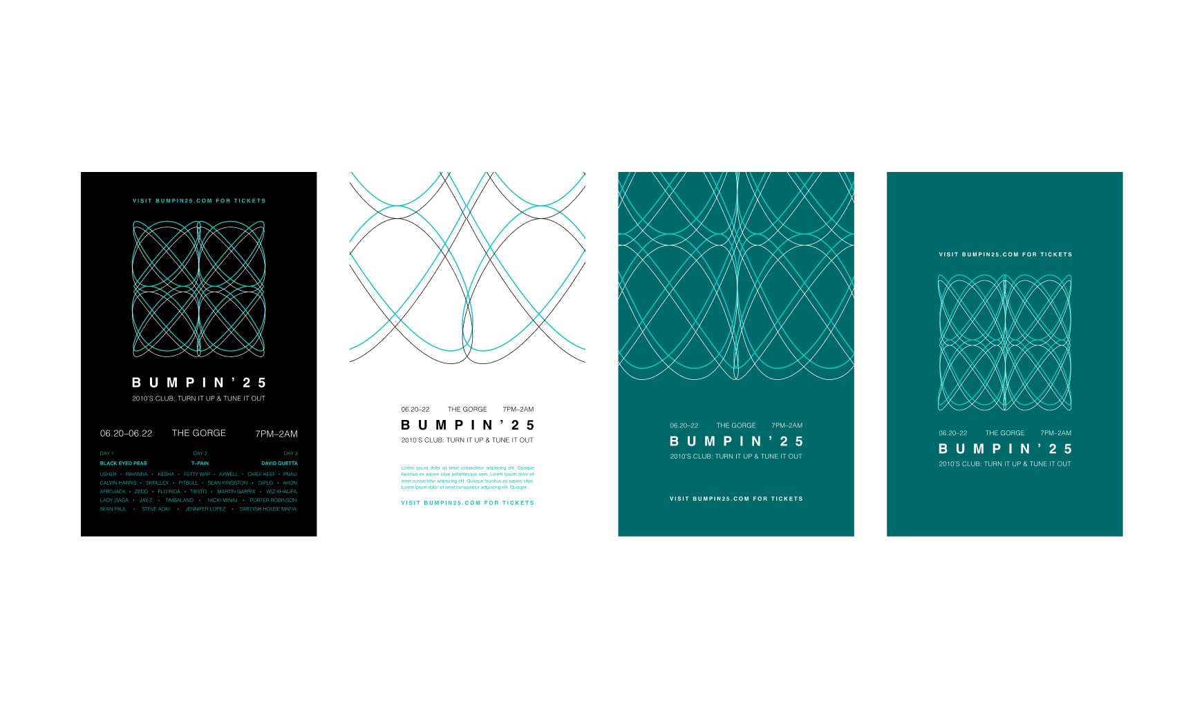
Application
The initial concept for BUMPIN'25 explored tech-inspired themes with neon and bright colors reminiscent of club and party scenes. We then shifted direction by examining album cover designs from popular 2010s music, specifically EDM albums like Calvin Harris's Motion. Drawing from this inspiration, we developed a design system using the album's color palette that better aligned with our creative vision and direction.

These applications demonstrate our consistent design system and cohesive visual language. Each piece maintains the same thin-lined shapes and sound wave-inspired patterns while adapting to different formats and use cases, creating a unified brand experience across all festival touchpoints.